GED Math Study Guide: Graphs & Functions
Graph and data interpretation are essential skills for making sense of information at a glance. In this section, you’ll learn how to read charts, tables, and plots to identify patterns, compare values, and draw conclusions from real-world data.
You’ll then move into functions and coordinate geometry, where you’ll see how mathematical relationships connect inputs to outputs and how those relationships can be represented visually.
Graph & Data Interpretation
Graphs help us visualize data, identify trends, and make comparisons. We use different types of graphs depending on the purpose of visualization.
Line Graphs
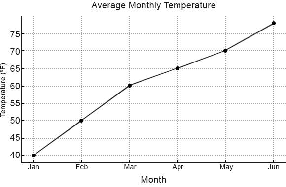
Line graphs show how data changes over time or across categories. Each point on the graph represents a data value, and these points are connected by lines to highlight trends, patterns, and relationships.
Line graphs are particularly useful for visualizing changes in data over continuous periods, like temperature fluctuations throughout a day or stock prices across months. The horizontal axis (\(x\)-axis) typically shows the time or category, while the vertical axis (\(y\)-axis) displays the measured values.
When reading a line graph, pay attention to:
- Upward slopes (indicating increases)
- Downward slopes (showing decreases)
- Flat sections (representing stability)
- Peaks and valleys (highlighting maximum and minimum values)
Bar Graphs
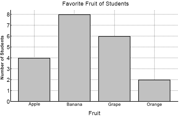
Bar graphs use rectangular bars to compare data across different categories. Each bar’s height or length represents a value, making it easy to see differences, similarities, and patterns at a glance.
Bar graphs work best for comparing categories such as sales by product, population by country, or survey responses. The categories typically appear along one axis (usually the horizontal), while the measured values appear on the other axis.
When interpreting a bar graph, focus on:
- The relative heights of bars (showing which categories have higher or lower values)
- Groupings of similar heights (indicating categories with similar values)
- Outliers (bars that are much taller or shorter than others)
- Patterns across categories (like increasing or decreasing trends)
Dot Plots
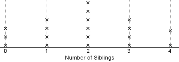
Dot plots (also known as line plots) display individual data points as dots or markers along a number line. Each dot represents one observation, creating a visual frequency distribution that shows how values are spread across a range.
Dot plots are ideal for small to medium-sized datasets where seeing individual values matters. They work particularly well for displaying test scores, measurements, or counts where you want to preserve the identity of each data point.
When analyzing a dot plot, look for:
- Clusters of dots or markers (showing common values or modes)
- Gaps (indicating ranges with no observations)
- The overall spread (revealing the distribution’s range)
- Symmetry or skewness (showing how values are distributed around the center)
Box Plots
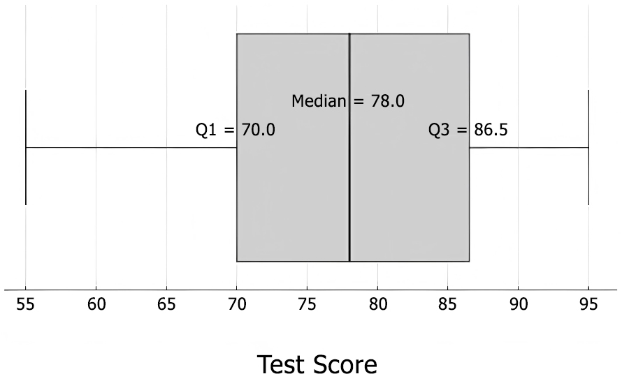
Box plots (also called box-and-whisker plots) provide a visual summary of how data is distributed. They display five key statistics—the minimum, first quartile, median, third quartile, and maximum—creating a comprehensive picture of a dataset’s spread and central tendency.
Box plots excel at comparing distributions across different groups or categories. They’re particularly useful for large datasets where other visual methods might become cluttered or for identifying outliers and understanding variability.
When examining a box plot, pay attention to:
- The box itself (representing the middle 50% of the data)
- The median line (showing the center of the distribution)
- The whiskers (extending to the minimum and maximum values within a reasonable range)
- Outliers (displayed as individual points beyond the whiskers)
- The box’s width and position (indicating skewness and central tendency)
Tables
| Name | Math Score | Science Score |
| Alice | 85 | 90 |
| Bob | 78 | 82 |
| Charlie | 92 | 89 |
| Diana | 88 | 94 |
| Ethan | 76 | 80 |
Data tables organize information in rows and columns, creating a structured format for presenting and analyzing data. Each row typically represents a record or observation, while columns contain specific attributes or variables related to those records.
Data tables serve as the foundation for most data analysis work. They’re essential for organizing raw data, performing calculations, and preparing information for more complex visualizations or statistical analysis.
When working with data tables, focus on:
- Column headers (defining what each variable represents)
- Row identifiers (showing which record each row contains)
- Cell values (containing the actual data points)
- Patterns within columns or across rows (revealing relationships)
- Summary statistics (often appearing at the bottom of the columns)
Functions & Coordinate Geometry
Slope
The slope of a line is a measure of its steepness and direction. It tells us how much the line rises or falls as we move from left to right across a graph.
The slope (\(m\)) is calculated using the formula:
\(m = \dfrac{(y_2 − y_1)}{(x_2 − x_1)}\)
Where \((x_1, y_1)\) and \((x_2, y_2)\) are any two distinct points on the line.
The slope has several important properties:
- A positive slope means the line rises from left to right
- A negative slope means the line falls from left to right
- A slope of zero indicates a horizontal line
- An undefined slope (when the denominator is zero) indicates a vertical line
In real-world applications, slope can represent rates of change like velocity, growth rates, or the steepness of a hill.
Example:
The slope of the line that passes through the points (1,2) and (3,6) can be calculated as follows:
Intercepts
The intercepts of a line are the points where the line crosses the coordinate (\(x\) and \(y\)) axes.
The \(x\)-intercept is the point where the line crosses the \(x\)-axis (where \(y = 0\)). To find it, set \(y = 0\) in the line equation and solve for \(x\).
The \(y\)-intercept is the point where the line crosses the \(y\)-axis (where \(x = 0\)). To find it, set \(x = 0\) in the line equation and solve for \(y\).
Intercepts are useful for quickly sketching graphs and solving real-world problems where initial values or threshold points are important.
Example:
Consider the line \(3x + 4y = 12\)
The \(x\)-intercept of \(3x + 4y = 12\) can be found by substituting \(y = 0\).
\(3x + 4(0) = 12\)\(3x = 12\)
\(x = 4\)
The \(x\)-intercept of the line is \((4,0)\).
The \(y\)-intercept of \(3x + 4y = 12\) can be found by substituting \(x = 0\).
\(3(0) + 4y = 12\)\(4y = 12\)
\(y = 3\)
The \(y\)-intercept of the line is \((0,3)\).
Equation of a straight line
The slope-intercept form of a straight line is one of the most commonly used forms, written as:
\(y = mx + b\)
Where \(m\) is the slope of the line and \(b\) is the \(y\)-intercept (the \(y\)-coordinate where the line crosses the \(y\)-axis).
Note
This form makes it easy to identify the slope and \(y\)-intercept at a glance. It’s particularly useful for graphing lines and understanding their behavior.
When you know two points on a line, (\(x_1, y_1\)) and (\(x_2, y_2\)), you can find the equation using the two-point form:
\(y − y_1 = m(x − x_1)\)
Where \(m\) is the slope of the line.
Functions
A function is a relationship where each input has exactly one output. Think of it like a machine; you put in a number, and you get exactly one number out.
Linear functions are the simplest type of functions. They follow this pattern:
\(f(x) = mx + b\)
This creates a straight line when graphed with slope \(m\) \(y\)-coordinate \(b\).
Example:
Consider \(f(x) = 2x + 3\)
When \(x\) increases by 1, \(y\) always increases by 2. The following values are represented by this function.
| \(x\) | \(y\) |
| 0 | 3 |
| 1 | 5 |
| 2 | 7 |
| 3 | 9 |
You can recognize a linear function because its graph always has a straight line, never a curved one.
Once you’re feeling confident with graphs and functions, test your skills with the review quiz below before moving on in our GED study guide.